For more detailed analysis swipe on the Canva where the arrow is.
MY FILM POSTER
TAG-LINES -
a short sentence that creates suspense and hints about the film.
The tagline for my film poster and trailer is "someone is always watching". This fits my film because The Institute focuses on the life of teenage girl Susannah in a boarding house, where she constantly feels in danger and is always kept a close eye upon. I researched further into what makes an effective tagline by looking at other film posters.
TAGLINES by Morven McIntyre
MY FILM POSTER DRAFT:
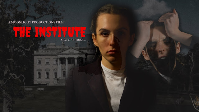
A film poster is an important marketing tool when producing a film. It is used to attract and audience to the film by creating an engaging and thrilling poster, that gives an idea of what the genre of the film is and the story it will tell. Introducing the audience to characters and locations. When creating our film poster I began by drawing out a plan so I could think of what pictures to put on the poster and writing.
I began to edit together a composition on photoshop, incorporating my character, Susannah Ecclestone as the main character, I believed it was important to show this character as the main focus as she plays a vital role within the film. When filming our hot seat we got strong images using our Cannon camera with studio lights. I placed one figure as the centre figure as well as 2 other figures behind with a low opacity, fading into the background. This creates the idea of different emotions the character may feel throughout the film and the different personalities that she may portray. Here I have not added in the billing block, star names or social medias. However this is a brief idea of the main visuals I wish to convey. I created a darker poster with Red writing as when I researched the codes and conventions of horror, I saw a strong correlation of lowkey lighting and dark tones.


Excellent reflective account of the process of research, planning, drafting and revisions leading up to the final product. Three beautifully presented deconstructions of film posters, showing solid genre research and subject knowledge.
ReplyDeleteFinal Poster: A stylish, streamlined and graphic poster that packs a punch but also has subtle shadowed layers outlining the building of The Institute. Your use of chiaroscuro lighting is bold and powerful, with half of the protagonist’s face in shadow, making her seem gaunt, anxious and hounded, especially combined with the posture of the hands cradling the head. The protagonist makes direct eye contact with the audience, establishing a bond. The handling of the central image fits the thriller / horror genre and provides a strong backdrop against which the red title and white tagline stand out clearly. The poster observes all genre conventions (talent, billing block, release date, social media). A classy piece of work.